I had to update a few things here like run destination, category, minimum OS, and the bundle identifier so that I could then push to testflight
Log in to leave a comment
I had to update a few things here like run destination, category, minimum OS, and the bundle identifier so that I could then push to testflight
Log in to leave a comment
Final adjustments and stuff, and i pushed to app store connect to put on testflight to then submit
Log in to leave a comment
I adjusted the padding on these, it is a bit hard to tell but it looks much more balanced. I also sped up the animation for the tableview bookmark highlighting, and added some more accessibility modifiers
Log in to leave a comment
i added some improvements to the table view, added a toolbaritem, and a bookmarks button that dims non bookmarked items, and also fixed some padding around the. i might add zooming in and out again later, once i fix the issues that presents
Log in to leave a comment
I added some animation to the toolbar items and spaced them out, i cant show it in the photo below but it looks really really good, i love it
Log in to leave a comment
updated the png to a jpeg so that i could push it to testflight, waiting for a review to maybe then release
Log in to leave a comment
I got very very carried away so I’ll just put a paragraph here
The first thing I did was add haptics when you open/close a sheet and when you change tabs, because these are navigation actions, so I thought it makes sense.
I also implemented TipKit to show about 10 different Tips around the app, helping the user find out how to use the app and make use of all of its features. It was quite annoying to make TipKit work because there isn’t much support online and its quite an obscure framework, as every other Apple framework seems to be 😭
Then I implemented accessibility across the app, accounting for text sizes, reduce motion, increase contrast and reduce transparency. It was actually very easy since the modifiers were really simple to use, like .accessibilityHint("This button adds this element to your bookmarks").
I also adjusted the pickers in list view to use a better background, and also added a new picker that can filter only bookmarks or just push them to the top.
I added some sheet transitions which are really nice, they make the sheet zoom out of the place where you clicked it, instead of just from the bottom of the screen, which is quite buggy but because of Apple’s api, not something I can fix.
I also had another really annoying thing where I couldn’t make the app read from the bundle, so I couldn’t load any json into it, so I had to hand-paste the massive json file into a Swift string, I finally fixed that now
And for the bookmarks I added a bookmark detail view in settings to see and delete them
I also added some progressiveblur at the top of the list view because for some reason .searchable removes all scroll edge effects and toolbar items, so it removed the auto-placed effect that keeps the time and status legible, so I had to just check if the keyboard was visible (because then the edge effect would be gone) and apply my own edge effect
Log in to leave a comment
i completely rewrote the quiz view, which uses apple intelligence to make and mark a quiz, and alert the user of their score, which i found quite hard because the model is quite small, and that meant my token size was small, only 4096 tokens, and also it just wasn’t very capable of following instructions, or marking questions properly (i gave it the question and right answer and user selection it still failed). i found that telling it not to do something explicitly made it do that thing, so my best option was to not talk about what not to do or else it would very much do that thing. i also added the usual transitions and animations to the questions and buttons etc. i quite like how the ai also generates the alert title and message and button, making it quite unique and unpredictable, which in this rare case is actually a good thing!
Log in to leave a comment
because onboarding only had one button i moved it out into the general section of settings, and i added sorting to the list view.
Log in to leave a comment
in the list view i swapped around the number and symbol so that they could lay themselves out better, and for the filter pickers i refined their foreground colour, background shadow, and spacing.
Log in to leave a comment
i decided to overhaul the table view because it was really buggy and glitchy. i removed the NavigationStack, because that appeared to make the scrollview glitch when scrolling around the edges, I tried everything but removing the Title ToolbarItem and NavigationStack was the only thing that worked. I also removed the Slider because that was unnecessary after I thought about it. Because iOS provided a scroll edge effect by default when i had toolbar items, and I removed them, I had to implement my own custom progressive blur to cover the top edge of the screen, I also added some admittedly nonoptimal custom padding to the container, which wasn’t even symmetrical, although now it looks good so I’m happy.
Log in to leave a comment
i refined the intro view, it now applies a really nice scale and blur effect when scrolling, which also allows the user to scroll backwards and forwards instead of just forwards, and removes the bottom bar buttons to make the image bigger.
Log in to leave a comment
some ui refinement and simplification, like adding a glass effect to the wide button to make sure people know its a button, and the zoom level has no background because its not a button. the iphone view is also simpler because it doesnt need to display all that info.
Log in to leave a comment
I’ve updated teh ui, and also added lens switching and better zoom. there is a slight problem with legibility and also discovering lenses reliably but ill fix them later, I’m really happy with the image space saving. i used HEIC, which is already really efficient, then applied further extreme compression to take down the size to 15kb each, allowing me to keep fps at 10 and resolution at max
Log in to leave a comment
I’ve got a first version working although there are still some bugs, such as the frame just hanging and it not rotating properly
Log in to leave a comment
I added more transaction types because I just realised all my old ones were just negative, so now depending on if your transaction is positive or negative it shows different options for the transaction types. the other two screenshots show my first first migration, because i needed to rename one of the existing enum cases, and that failed because i was trying to convert a native postgres enum when i was just using swift codable to store them as strings
Log in to leave a comment
made the graph view more refined with the visual style and with selection
Log in to leave a comment
removed the download directory button because it doesn’t make sense
Log in to leave a comment
i refined the charts, and added transitions and hover selection. i will add more charts later probably
Log in to leave a comment
I added sideways support for iphone, and an ipad and a mac target, which is built for ipad, and an alnalysis tab that i will add more things to, such as a pie chart of all expenditure from the categories i have
Log in to leave a comment
I added some design refinements and moved the files from Next,js /public to its own cdn, which allowed me to push this to GitHub because before the files were too big to push
I’m very happy with the amount of money saved so far
final refinements and I’m done
Log in to leave a comment
added haptics when the tab changes
Log in to leave a comment
i added the watch app, which is completely independent of iPhone except for the user login token, because login and signup and account settings shouldnt be on the watch. this is so that it doesnt need to be near its iphone to pull data from it, but directly from the server.
Log in to leave a comment
added watch app, and going to start developing that
Log in to leave a comment
added delete account, and in the process also fixed signup and log in functionality because they were also returning mismatching types and showing an error even when it was successful
Log in to leave a comment
refactored it because it was starting to get quite messy and i was duplicating database and networking logic which was really bad and crashed it every time a switched tabs after changing items, etc
alot of bug fixes for the server and the client, from json decoding problems to mismatched types and other weird stuff.
i also finished teh listview, along iwth its detailview to patch them. i havent added deleting yet.
and on the home screen i made the background red when in the negatives
Log in to leave a comment
i refined the ui, mainly on teh homeview toolbar items and the add transactiondetailview, i think it looks better now and since i couldnt tint the picker options i tinted the price field.
Log in to leave a comment
i made the screens below, obviously theres more to come, and fixed quite a few server bugs and added some routes. i am taking extra time to make sure the code is clean and has animations everywhere, along with forcing liquid to behave as it should. the add transaction page might change quite a bit because i still dont like some sizing and spacing there.
Log in to leave a comment
ok i set up all the server routes for users and transactions and tokens and stuff, and i initialised everything on github and also setup the xcode app, below is the home screen i spent too much time adjusting the padding on
Log in to leave a comment
Read the docs for vapor, the backend I’ll be using, and initialised the database and frontend app.
Log in to leave a comment
updated blur to look better at the cost of a bit of performance
Log in to leave a comment
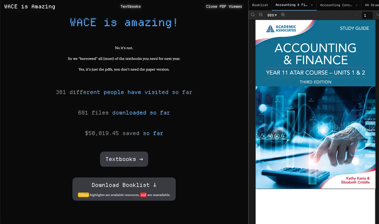
after an hour i finally cleaned up all the errors with the update such as CORS for the pdf, the booklist which was treated differently, and encoding/decoding uri problems. it is fixed now, and the sidebar is working
for now
Log in to leave a comment
migrated to the new server properly this time, now i need to fix that pdf previewer
after a lot of time got the cdn and server and frontend working, wace.jdqc.dev
Log in to leave a comment
same as last ship but fixed the major issue which was mobile screens. due to the graphics and simply the amount of text that needs to be displayed, i decided you cant view on mobile so i added a blocker that tells the user to zoom out or use a bigger screen to view.
smaller viewers cant access the site, they need to zoom out or pick a larger screen to view. this is because a large canvas is required to display the website properly
Log in to leave a comment
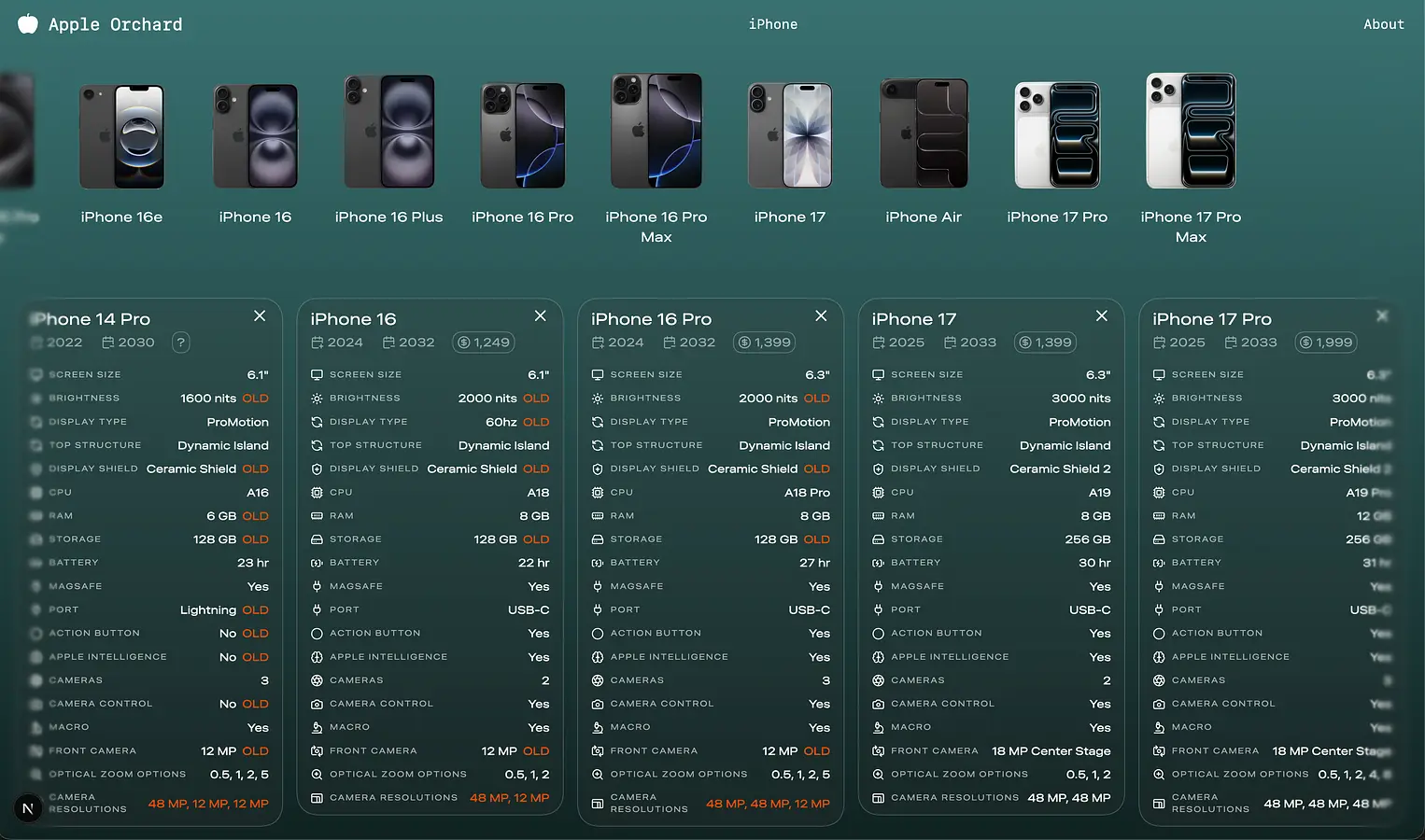
i made this website cos I’m getting a new iphone soon and i wanted something to help me compare iphones clearly and simply, apples compare page was massive with random things i dont even know about, this gives the important specs in a clear and simple format. i might ship later again with more features and stuff
finished all prices that i could, half of these cant get a price because they are too old
Log in to leave a comment
I made this before flavortown but during flavortown i refactored and redesigned stuff and improved everything, made as many things run on server as possible, etc. i really like the design language
final refinements and i think I’m done
Log in to leave a comment
updated about page, should add more things later
Log in to leave a comment
I’ve decided to remove the currency localisation its too complicated
it will just be aud becase even with multipliers i found teh prices arent consistent, by hundreds of dollars, and i cant manually add all the prices for each device and all of its storage options etc
Log in to leave a comment
i do really like this panel. i think adding the border makes it visibly clickable. hopefully
Log in to leave a comment
you can click the price to show options and rough refurbished price
Log in to leave a comment
added an explainer and refined its style
Log in to leave a comment
i love the design of this modal, very cool
although, you should consider adding actual currency conversion instead of this multiplier thing
currency is now working and doesnt have any bugs (that I’m aware of) the user adds a multiplier to put it in their own currency to find out the rough price, which multiplies the aus price with that multiplier to get their currency. its too complicated to figure out this locale stuff and get and set currencies etc
Log in to leave a comment
fixed the bugs abotu scaling and hover stuff
Log in to leave a comment
… my currency is not pounds
these locale and currency things are really annoying
Log in to leave a comment
i have started to add price but that is going to be difficult becase some iphones arent being sold new anymore, some refurbished, theres many locales to deal with, storage pricing, etc.
Log in to leave a comment
alright i made it smaller and also fixed the layout bugs that came as a result of the card getting taller etc
now i need to add price (somehow for multiple countries - maybe i need to have it as a relative scale not absolute for each currency), and other filters, and other things
Log in to leave a comment
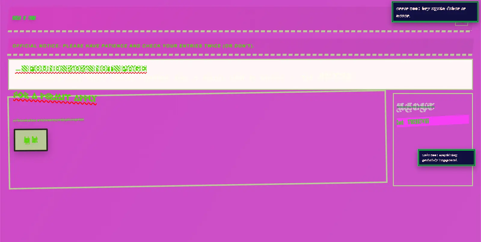
its just a form you have to complete but its basically impossible ngl. i just dumped every single css rule that exists and ended up with this, along with some engines to do all kinds of things like the sound, the theme changing, font changing, random rotations and skewing, etc
refinements
Log in to leave a comment
there added all this, nut now because theres so many things here the layout needs to be adjusted a bit so that the cards still fit. i need to make everything smaller etc.
Log in to leave a comment
fully removed all references to other devices, now I’m going to expand the information a little bit and add the actual features that will help with buying
Log in to leave a comment
after a very very long amount of torture I’ve decided that i can only do iphones because of the way apple’s source device iamges work, because teh iphones have scaling in photo while other devices have scaling set externally which would take me a very long time to replicate myself. so i will focus all on iphones.
Log in to leave a comment
starting work on the ipad info sections now
Log in to leave a comment
i refactored the repo to use as much shared code as possible and this is my detail page! so small yet has all the information needed. i could even dynamically create the routes for iphones and ipads etc later
Log in to leave a comment
this layout system is almost done, i need to fight with teh z-index a bit and then I’m done ill add more devices and properties
Log in to leave a comment
i have like a shelf thing to pin the stuff to compare phones emroe easily
Log in to leave a comment
alright i fixed that error and another one that was complaining. Next Image props are very coconfusing and have weird quirks about autosizing and apsect ratio etc.
Log in to leave a comment
trying to figure out a weird bug - iphone air only shows on localhost, and in prod it shows as 404. hmm.
Log in to leave a comment
ok i pushed to production and added https and git push production
Log in to leave a comment
ok its working now i need to deploy
Log in to leave a comment
ok got persistent popups working, now i need to make the last dragged one move to the top
Log in to leave a comment
it is now draggable, nice
Log in to leave a comment
trying to make it draggable, proving quite hard
Log in to leave a comment
added more images and did some refactoring and style refining
Log in to leave a comment
i think it looks nice now
Log in to leave a comment
i think tis nearly done, it doesnt explain what it does much yet
Log in to leave a comment
starting to make the home page now
Log in to leave a comment
better, i need to customise some values and annotate them with old, as it shows there
Log in to leave a comment
looking better, now I’m going to make it rows instead of these boxes cos they waste space
Log in to leave a comment
this close button really isnt centering
Log in to leave a comment
not done yet, but better already, I’m starting to style the specifics instead of just dumping everything in.
Log in to leave a comment
ah yes forgot to set z-index
added progressive blur and also refactored so that its a bit more organized and ready for multiple device lineups
Log in to leave a comment
the text is laid out badly i know but i really like these backgrounds that are really subtle like a blur or glass and with a thin border
Log in to leave a comment
very ugly right now
Log in to leave a comment
i settles on no background for navbar, think its quite clean, and will be readable since the whole website will be exactly 100vh so there isnt going to be any content udnerneath it
Log in to leave a comment
ok the animated background graadients now work, I’m going to make teh namvbar better now then start eh content
Log in to leave a comment
currently trying to design the background gradient for something like teh new watchos tabview container backgrounds, and to make it animate when you change pages
Log in to leave a comment
finished most of the data for iphones, now i will make the ui home page, then the actual timeline for the devices
Log in to leave a comment
done these, i wont go all the way back until i finish the ui and the i can go and finish the models, and also add more properties
Log in to leave a comment
starting to make the schema and then ill start research the data in, shouldnt take too long because I’m getting trivial things
Log in to leave a comment
i made it a bit more reasonable
Log in to leave a comment
its not a nice listen…
Log in to leave a comment
button is hard to catch
Log in to leave a comment
first version
refactor: accessibility, semantic html tags. now I’m actually done for the day
Log in to leave a comment
done for today
Log in to leave a comment
built out this section, will add more things though and refine further
Log in to leave a comment
thinking of other things to put here
Log in to leave a comment
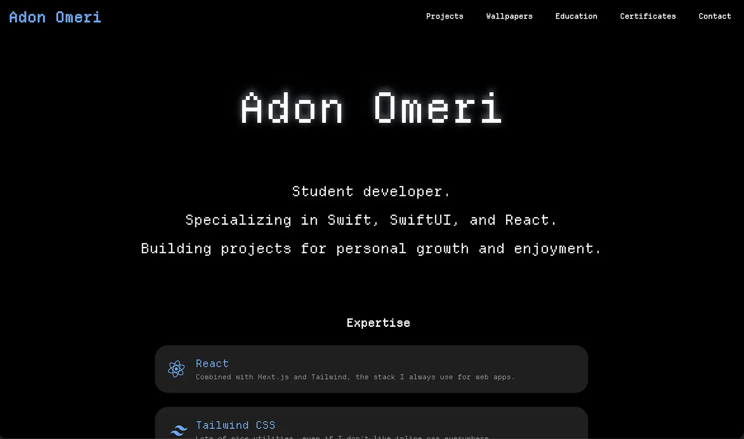
the bird animates now, and i decided to make it an expertise section instead of journey because i found it makes more sense to put
Log in to leave a comment
i dont like this layout so I’m brainstorming of some other designs for the journey section
Log in to leave a comment
i decided to remove it it doesnt look good
Log in to leave a comment
there is supposed to be an icon here but because i want my svg to be a random colour, i need to use a library that only supports webpack, and I’m using turbopack, so I’m trying to find some workarounds than hardcoding some colour
Log in to leave a comment
prod server got hacked, trying to figure out what caused it
lucky i commit alot!
Log in to leave a comment
fixed the gap and layout between the elements and made journey its own page
Log in to leave a comment
started to add a “journey” section to the homepage
Log in to leave a comment
I’m going to add a few parts to my intro page animation and content to make it a bit more contentful instead of just an animation
Log in to leave a comment
updated the footer
Log in to leave a comment
made a few refinements to the scroll blur, home page intro animation, etc
Log in to leave a comment
added a spinner while the images are compressing
Log in to leave a comment
i removed teh navbar background with this progressive blur
Log in to leave a comment
trying to fix a bug where the buttons arent showing
Log in to leave a comment
added sitemap and made pushing to prod easier
Log in to leave a comment
refactored everything!
Log in to leave a comment
refactoring the whole codebase, updating css names and structures, adding formatting, renaming some components, making as many things as possible server-side.
Log in to leave a comment
starting to refactor the repo to make it a bit faster and cleaner
Log in to leave a comment
adding in projects now
Log in to leave a comment
added buttons to the home screen and added hover effects across the site
Log in to leave a comment
made this design better
Log in to leave a comment
started working on the projects page, and cleaning up some components like the footer.
Log in to leave a comment
theme switcher
Log in to leave a comment
nearly done
Log in to leave a comment
updated some animations between pages
Log in to leave a comment
added contact page
Log in to leave a comment
making the mobile navbar menu!
Log in to leave a comment
updated navbar to be a bit more spaced out and cleaned up repo a bit
final fixes and typos
Log in to leave a comment
fixed some types and added intro views
Log in to leave a comment
finished it, i might refine it later but its basically done. i like it
Log in to leave a comment
trying to make it look nice but there are so many components and labels for marking etc. also the foundation models are not very good at marking
Log in to leave a comment
having fun prompt building for the apple foundation model.
Log in to leave a comment
Finished the intro view and doing the quiz now that is going to use Apple Intelligence
Log in to leave a comment
done standardising the intro views to have the same layout, now adjusting some padding and spacers.
Log in to leave a comment
Started the intro for the table view, first bug being the text not going on multiple lines.
Log in to leave a comment
Starting to make the introduction view that tells the user all about teh app and its features
Log in to leave a comment
cleaned up a few things and the revert seems successful so far, added ticks to the stepper and adjusted padding and alignment in the list view
Log in to leave a comment
reverted to an eariler version, maybe i get a new idea for something that works better then my only working idea which is a zoom slider and no finger gesture which is annoying but removes all of my problems
Log in to leave a comment
I’m trying to make the grid actually work with the pan and zoom gestures without conflicting with the buttons, which is very annoying and i cycle between flat out not working, to being very slow, to just pressing the buttons instead of scrolling, etc.
Log in to leave a comment
I’m working on my first project! This is so exciting. I can’t wait to share more updates as I build.
Log in to leave a comment